January 15th, 2026
Best CTA Button Examples for Landing Pages
10 real CTA button examples with design, copy, and placement tips to boost landing page conversions and reduce user hesitation.
Warren Day
Your call-to-action (CTA) button is the final step in turning visitors into users. Without it, there’s no way to guide users toward taking action. A strong CTA removes hesitation, provides clarity, and drives conversions. For example:
- Placing a CTA above the fold can boost conversions by 317%.
- Changing copy from “Start your trial” to “Start my trial” increased clicks by 90%.
- Fox Pest Control’s switch to a “Text With Us” widget led to a 201% jump in conversions.
The best CTAs combine clear design and action-focused copy to answer two key questions: Where should I click? and Why should I click? Below are 10 examples of effective CTAs, each tailored to specific audiences and goals.
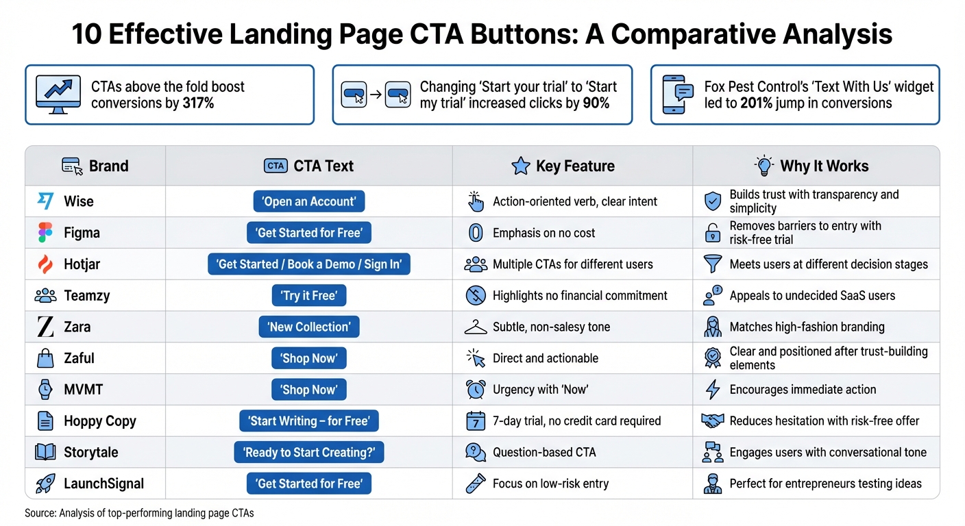
10 High-Converting CTA Button Examples Comparison Chart
Quick Comparison
| Brand | CTA Text | Key Feature | Why It Works |
|---|---|---|---|
| Wise | "Open an Account" | Action-oriented verb, clear intent | Builds trust with transparency and simplicity |
| Figma | "Get Started for Free" | Emphasis on no cost | Removes barriers to entry with risk-free trial |
| Hotjar | "Get Started / Book a Demo / Sign In" | Multiple CTAs for different users | Meets users at different decision stages |
| Teamzy | "Try it Free" | Highlights no financial commitment | Appeals to undecided SaaS users |
| Zara | "New Collection" | Subtle, non-salesy tone | Matches high-fashion branding |
| Zaful | "Shop Now" | Direct and actionable | Clear and positioned after trust-building elements |
| MVMT | "Shop Now" | Urgency with "Now" | Encourages immediate action |
| Hoppy Copy | "Start Writing – for Free" | 7-day trial, no credit card required | Reduces hesitation with risk-free offer |
| Storytale | "Ready to Start Creating?" | Question-based CTA | Engages users with conversational tone |
| LaunchSignal | "Get Started for Free" | Focus on low-risk entry | Perfect for entrepreneurs testing ideas |
Each of these CTAs demonstrates how design, copy, and placement work together to drive clicks. Whether you're aiming to sell, collect leads, or encourage exploration, the right CTA can make all the difference.
1. Wise's 'Open an Account'
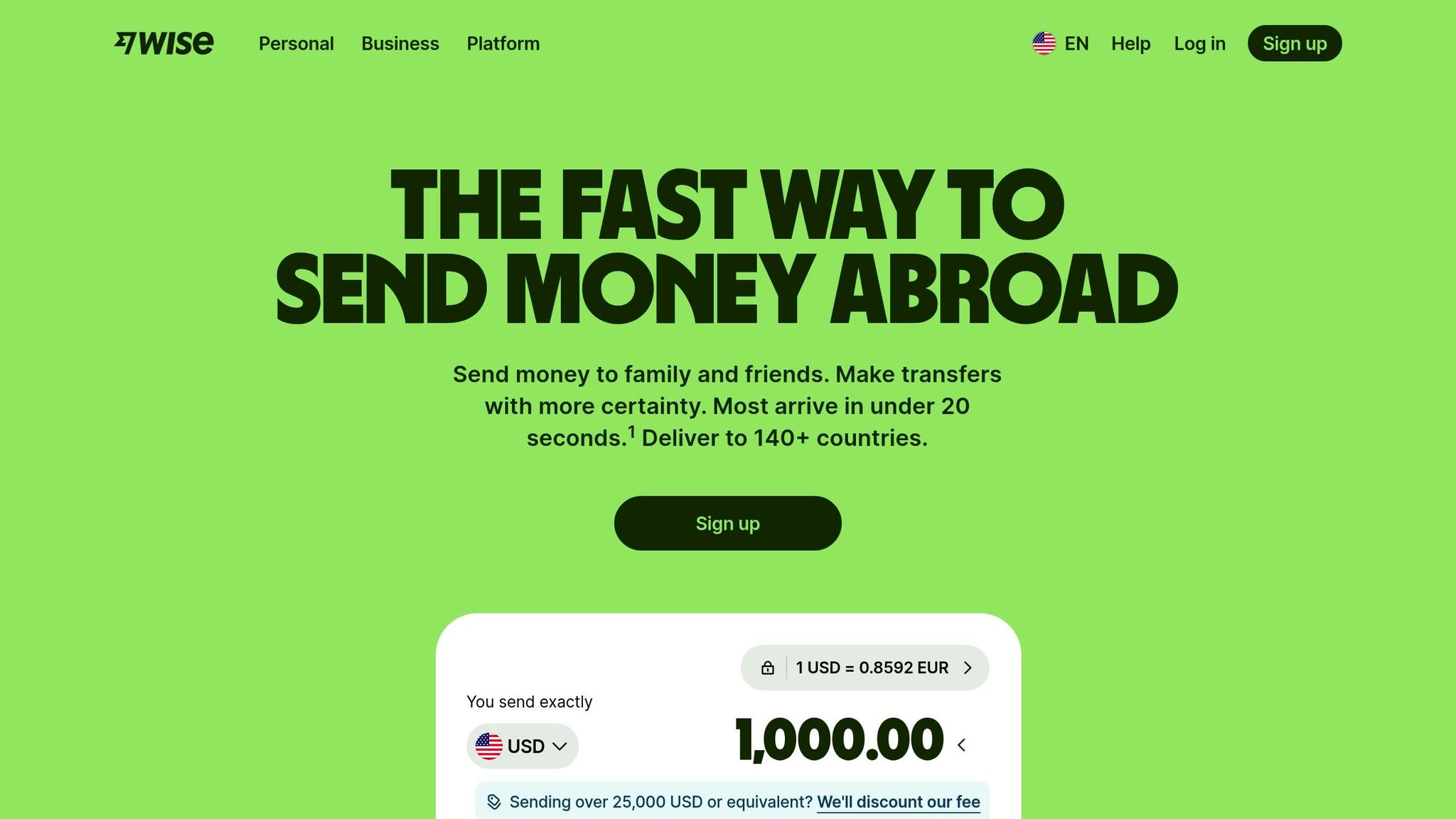
Wise’s call-to-action (CTA) button stands out by using the phrase "Open an Account" instead of generic options like "Get started" or "Learn more." This clarity leaves no room for confusion about what the user is clicking on.
The choice of the word "Open" is deliberate. It’s an action-driven verb that gives users a sense of control and urgency, signaling that they’re about to begin a straightforward process. In the fintech world, where trust is critical, this kind of transparency aligns perfectly with user expectations - most visitors come to Wise with the intent of opening an account.
The design of the button is equally thoughtful. Its high-contrast color, generous white space, and dimensions (at least 48 pixels square) make it visually prominent and easy to tap, especially on mobile devices. These details ensure it meets accessibility standards. Features like a subtle corner radius and a drop shadow further emphasize its interactivity.
To address potential concerns right away, Wise incorporates supportive microcopy such as "for free" or "no credit card required." These small but impactful additions help eliminate hesitation and encourage users to proceed.
This level of precision in crafting a CTA sets a strong foundation for other successful strategies.
2. Figma's 'Get Started for Free'
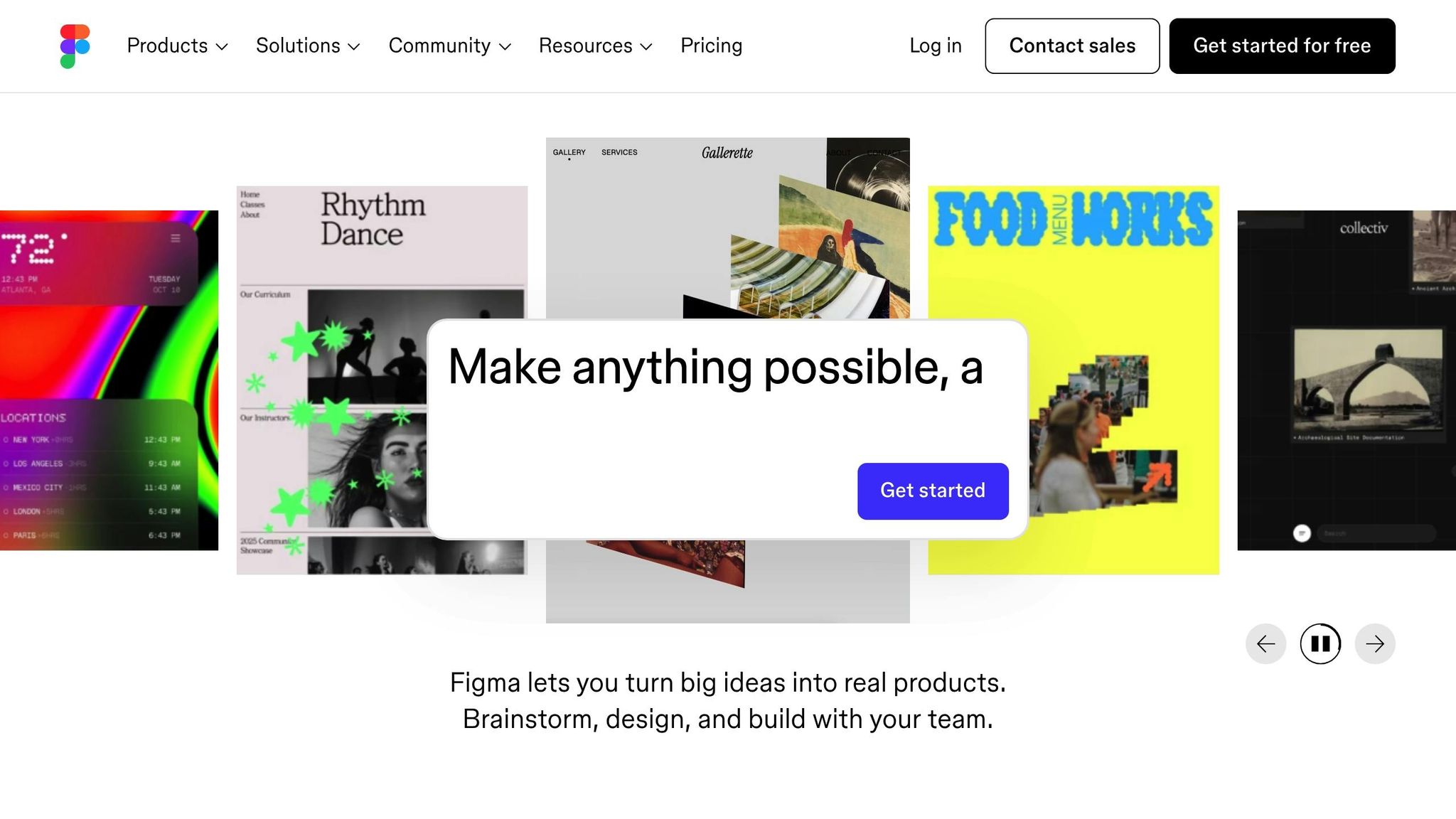
Figma’s call-to-action (CTA) button, "Get Started for Free", is a masterclass in simplicity and transparency. It tackles one of the most common concerns right away: Will this cost me anything? By emphasizing that users can start without spending a dime, Figma eliminates a key barrier, making the decision to click feel effortless and risk-free. But there’s more to this phrase than just its cost-related reassurance - let’s unpack why the word "Get" plays a pivotal role in its effectiveness.
Unlike words like "Buy" or "Submit", which can feel heavy with commitment, "Get" highlights immediate value. It’s a subtle yet powerful way to focus on what users gain rather than what they give. This kind of benefit-driven language has been shown to increase conversions by as much as 161%. For Figma's audience - designers, engineers, and product managers - this resonates perfectly. They’re looking for an easy, no-strings-attached way to explore Figma’s collaborative tools before diving in fully.
Figma doesn’t stop at just one button, though. The CTA is strategically placed throughout the page - in the hero section, mid-page, and footer - to ensure users have multiple chances to take action.
The design of the button itself also works to draw attention. A clean layout with generous white space ensures high contrast, naturally guiding the eye toward the CTA. Interactive hover effects add a layer of engagement, offering visual feedback that makes the button feel responsive and inviting.
To make the invitation even more enticing, Figma pairs the button with supporting text like "From wireframe to website, faster." This additional copy underscores the immediate benefit of clicking, reinforcing the idea that starting is both quick and rewarding. Together, these elements turn the button into more than just a link - it becomes a compelling opportunity to explore, risk-free.
3. Hotjar's "Get Started" Trifecta
Hotjar takes a refreshing approach to the typical call-to-action (CTA) by offering not just one, but three options tailored to different user needs. Instead of relying on a single button, Hotjar provides a trio: "Get started" (primary), "Book a demo" (secondary), and "Sign in" (tertiary). This setup isn't about overwhelming users; it’s about meeting them at whatever stage they’re at in their journey.
Each option serves a specific purpose: new users ready to explore can jump right in, potential customers can request a demo for more insight, and returning users can quickly log back in. This reduces friction and makes the experience straightforward. As Andi Coombs, Senior Marketing Manager at KlientBoost, explains:
"Hotjar... gracefully sports the popular Get started / Book a demo / Sign in trifecta. Making the signup stage easy is key for conversion experts".
The design plays a big role here. The "Get started" button stands out with bold, high-contrast colors, grabbing attention immediately. Meanwhile, the "Book a demo" button uses a more understated, outlined style, creating a clear visual distinction without overwhelming users. This thoughtful design helps avoid decision fatigue.
To make things even simpler, Hotjar integrates Google and SAML SSO for the "Get started" and "Sign in" options. These one-click login features remove the hassle of lengthy forms, making it easier for users to take action. Considering that 90% of visitors skim headlines and CTAs, this streamlined process is crucial.
Hotjar smartly places this CTA trifecta above the fold and repeats it at key points throughout the page. Whether someone is quickly scanning or reading every detail, these clear, actionable options are always within reach.
4. Teamzy's 'Try it Free'
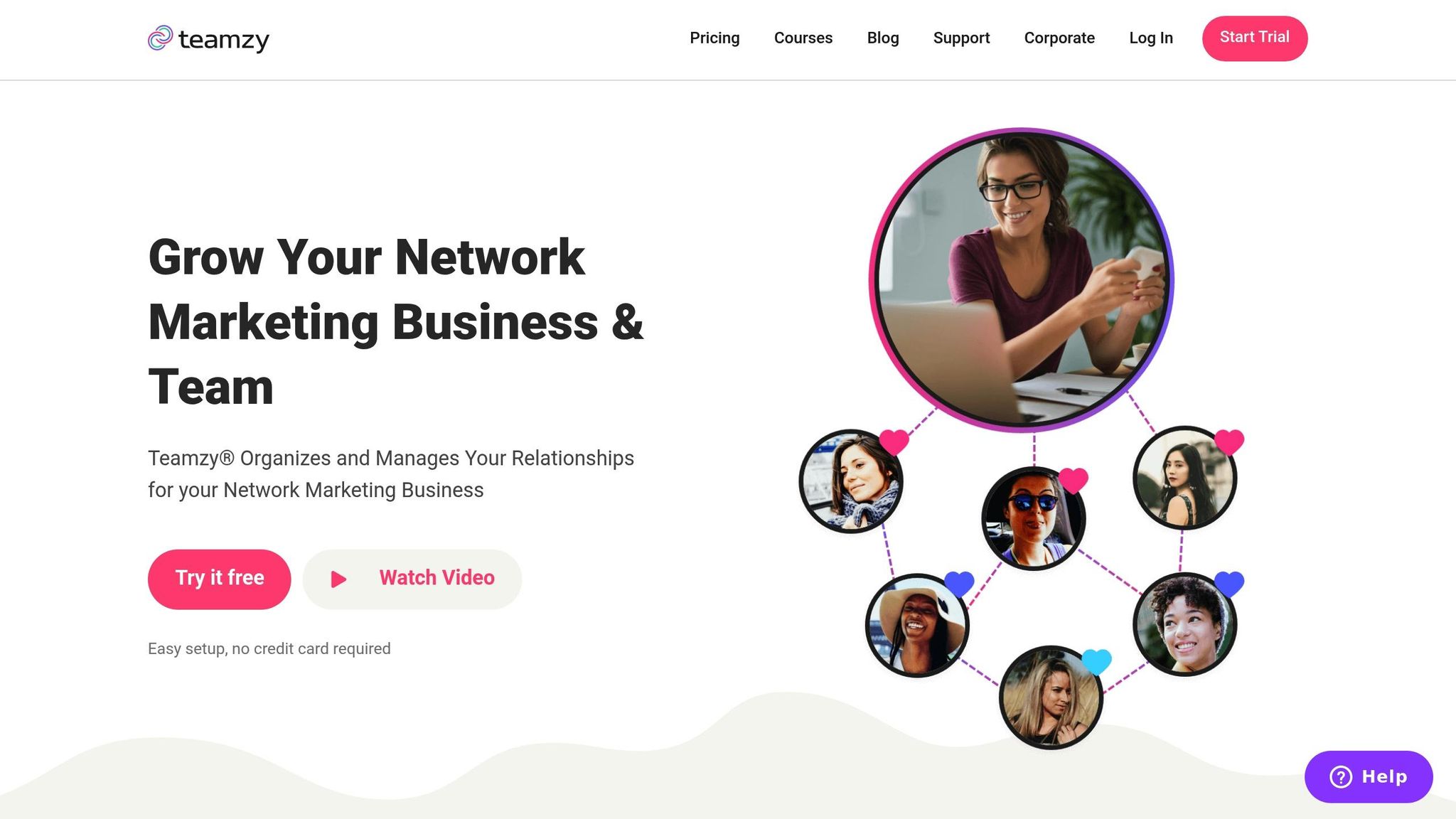
Teamzy keeps its call-to-action (CTA) simple and direct with one clear phrase: "Try it Free." This approach resonates with SaaS audiences who often want to explore a product without committing financially upfront. It taps into what marketers call "warm intent", targeting visitors who are still weighing their options and haven't fully committed yet. This clarity in messaging lays the groundwork for a strong CTA strategy.
The word "Free" is powerful - it eliminates the perception of risk and invites users to experience the product without any strings attached. Instead of overwhelming visitors with forms or registration requirements, "Try it Free" shifts the focus to the immediate benefit: hands-on product experience.
To ensure maximum impact, Teamzy reinforces this CTA multiple times across the page. Repeating the message ensures it remains visible and accessible, offering users several chances to engage. The button's high-contrast design further enhances visibility, making it stand out even during a quick scroll.
The simplicity of the message also helps reduce mental effort for visitors. There’s no ambiguity about hidden fees or credit card requirements - just a straightforward invitation to explore. This aligns perfectly with the mindset of SaaS buyers, who want to confirm that the product fits their needs before committing to a purchase.
To complement the primary "Try it Free" button, Teamzy includes a secondary option: "Watch Video." This gives users who prefer more information another way to engage. By offering both choices, Teamzy accommodates different levels of user readiness while keeping the primary action front and center.
5. Zara's "New Collection"
Zara takes a different approach when it comes to e-commerce calls-to-action (CTAs). Instead of the typical "Buy Now" or "Shop Now" buttons, Zara opts for "New Collection" - a subtle invitation rather than a direct sales pitch. This choice reflects the brand's high-fashion identity, making the homepage feel more like a sleek editorial spread than a traditional online store. The design elements further amplify Zara's refined, minimalist vibe.
The visual aesthetic is rooted in a striking black-and-white color scheme, which exudes sophistication. Studies reveal that 42% of consumers associate the color black with high quality, and color influences up to 90% of a user’s initial impression. Zara capitalizes on this by consistently using its signature "Linotype Didot Pro Bold" font, which enhances its polished and cohesive branding. Product designer Srawaniburgoju explains:
"Its black color indicates its special style, elegance, and luxury".
Instead of relying on a carousel to showcase products, Zara highlights the CTA on a bold, dominant hero image. This strategic placement grabs users' attention immediately, eliminating the need for scrolling and ensuring the message stands out.
sbb-itb-9a9c51d
6. Zaful's "Shop Now"
Zaful's "Shop Now" button keeps things simple and clear. Instead of using vague phrases like "Discover solutions" or "Submit", it opts for direct, actionable language that tells visitors exactly what to do. This approach works because research shows that unclear labels are often ignored by users.
The button itself stands out visually. Its bold black color against a light background creates a high-contrast effect that naturally grabs attention - almost like it's "shouting" for you to notice it.
Positioned strategically after key product details and trust-building elements like customer ratings, the button aligns perfectly with the AIDA model (Attention, Interest, Desire, Action). By placing it where users are most likely ready to make a decision, Zaful turns casual visitors into paying customers. It's a smart mix of clear messaging, eye-catching design, and thoughtful placement.
7. MVMT's "Shop Now"
MVMT’s "Shop Now" button is a prime example of how a simple, direct call to action (CTA) can work wonders in e-commerce. The phrase is short and to the point, leaving no room for confusion about what users should do next.
What makes it even more effective is the sense of urgency built right into the wording. The inclusion of "Now" taps into the psychology of immediacy. As William Gadea puts it, when you want someone to act, it’s essential to encourage them to do it right away.
The button’s placement is just as intentional. MVMT positions its main CTA above the fold, the area of a webpage where users spend around 80% of their time. To ensure they don’t miss out on engagement opportunities, additional CTAs are scattered further down the page, giving visitors multiple chances to click.
Design-wise, the button stands out thanks to smart use of contrast. A dark button against a light background naturally draws attention. Surrounding it with plenty of white space keeps the layout clean and ensures the button remains the focal point.
To top it off, MVMT uses subtle hover effects - like a border color change - to provide instant feedback. This small but impactful design choice reassures users that the button is clickable, reducing hesitation and encouraging action. Together, these thoughtful details make the "Shop Now" button a powerful tool for driving conversions.
8. Hoppy Copy's "Start Writing – for Free"
Hoppy Copy’s call-to-action (CTA) button, "Start Writing – for Free," keeps things simple and persuasive. It promises an immediate benefit - starting to create content - without the hassle of upfront payment. The mention of a 7-day free trial with no credit card required directly tackles common user concerns, making the offer feel genuinely risk-free.
The placement of this CTA is no accident. It appears strategically after users have explored the platform's features and read testimonials, making it the final nudge toward action. To reinforce credibility, the microcopy just below - "Join 100,000+ marketers" - adds a layer of social proof.
Design-wise, the button stands out with its high-contrast, all-caps style, ensuring it grabs attention. Studies reveal that 90% of visitors who read a hero banner also engage with the CTA copy. And with over 3,532 customers rating Hoppy Copy 5/5, the combination of clear messaging, smart placement, and trust signals works seamlessly to drive conversions. It’s a textbook example of how to blend design, psychology, and strategy effectively.
9. Storytale's "Ready to Start Creating?"
Storytale's call-to-action (CTA) button stands out by asking a question rather than issuing a command. "Ready to Start Creating?" draws users into a conversation, subtly encouraging them to mentally commit to the creative process. This small psychological nudge, often called a micro-commitment, helps pave the way for a click. The question is paired with a design that complements its inviting tone, making it even more effective.
The use of the verb "Creating" is intentional, speaking directly to designers, illustrators, and content creators. It shifts the focus from a generic action like signing up to something more meaningful - starting a creative journey. As Unbounce explains, "The perfect CTA shows people their clear next step. No confusion, no overwhelm - just the right action at the right time". Unlike commands such as "Submit" or "Register Now", this question-based approach reduces decision anxiety and gives users a sense of control over their next step.
The button's design also plays a key role in boosting engagement. High-contrast colors make it stand out during a quick scroll, increasing click-through rates by about 30% compared to plain-text links. This visual emphasis ensures users can easily spot where to take action, reinforcing the invitation to begin their creative journey.
10. LaunchSignal's "Get Started for Free"
LaunchSignal's "Get Started for Free" button takes the pressure off entrepreneurs who want to test their product ideas without making an upfront financial commitment. By removing this barrier, users can jump right into validating their ideas. This approach echoes the success of similar calls-to-action (CTAs) from leading brands.
The CTA is particularly effective for visitors who are comparing solutions. As Peter Lowe, Senior Content Marketer at Crazy Egg, explains:
"Get started for free... is a simple, low-risk, low-effort signup process".
This type of messaging creates a sense of psychological safety, letting users experiment with landing page validation without worrying about wasting money.
The choice of wording is intentional. The verb "Get" creates a sense of action, while "Started" suggests progress and aligns with LaunchSignal's mission of helping entrepreneurs take that crucial first step in validating their product ideas. Positioning the button above the fold ensures it grabs attention, leveraging the fact that visitors spend 80% of their time in this key area.
To build trust, LaunchSignal includes reassuring microcopy like "No credit card required" or "3 validation pages included", which reduces perceived risk and boosts user confidence.
The button's high-contrast design also plays a big role. This visual emphasis helps it stand out, leading to a 30% increase in click-through rates. By combining thoughtful design with clear messaging, LaunchSignal effectively turns curious visitors into active participants.
Conclusion
Effective CTAs are all about clarity and directness. As Peter Lowe from Crazy Egg aptly says, "Clear beats clever". Your audience should immediately understand what action they're taking - whether it's clicking on "Get My Free Guide" or "Start My Trial", the message should leave no room for guesswork.
The design of your CTA matters as much as the wording. Research shows that CTAs with a clear, high-contrast design can dramatically improve conversions. Even subtle shifts, like changing from second-person ("Start your trial") to first-person ("Start my trial"), have been shown to increase clicks by 90% in some cases. This combination of visual and verbal clarity can make all the difference.
CTAs should align with user intent. For example, low-commitment phrases work well for first-time visitors, while more direct prompts appeal to users ready to act. Adding reassuring microcopy, such as "No credit card required", can further reduce hesitation. The key is to design with intent and validate your approach using real user data.
A/B testing is your best friend. Small changes in copy or design can lead to massive gains - some tweaks have resulted in over 100% increases in conversions. Tools like LaunchSignal simplify the process, enabling you to create, test, and refine CTAs with features like email capture, questionnaires, and analytics dashboards. Each experiment brings you closer to a CTA that truly resonates.
Keep testing. That next big win could be just one experiment away.
FAQs
What makes a call-to-action (CTA) button effective on a landing page?
An effective CTA button grabs attention and motivates action with a mix of smart design and clear, engaging text. Use action-focused language like "Download Now" or "Start My Free Trial" to create urgency and make the action feel direct and personal. Incorporating first-person phrasing, such as "Claim My Offer", can also help users picture themselves taking that step.
From a design perspective, the button should visually pop. A contrasting color ensures it stands out, while a size that's easy to tap on mobile and sufficient whitespace around it makes it both functional and noticeable. Adding subtle touches like hover effects or shadows can enhance its interactivity. Placement is equally important - position the button above the fold and align it with the natural flow of the page to guide users effortlessly.
LaunchSignal streamlines this process with landing page templates featuring pre-designed, high-contrast CTA buttons. Plus, its analytics tools let you test and tweak elements like text, color, and placement to optimize for higher conversions.
How does the placement of a CTA button affect conversions?
The placement of a call-to-action (CTA) button can significantly influence how well it drives conversions. Positioning it in areas where users are naturally drawn - like above the fold, next to persuasive copy, or at the end of a cohesive content section - creates a smooth and intuitive path for action. This approach minimizes obstacles and encourages visitors to engage, often resulting in higher click-through rates.
Conversely, if the button is buried in a cluttered space or placed far from relevant content, it risks being ignored, which can hurt conversions. Experimenting with different placements - such as beneath a headline, centered on the page, or as a sticky button that stays visible at the bottom of the screen - can help pinpoint the best spot to capture attention and improve overall performance.
What makes A/B testing essential for improving CTA buttons?
A/B testing plays a key role in fine-tuning your call-to-action (CTA) buttons, giving you the ability to compare different versions to see which one gets better results. By experimenting with variations in text, color, size, or placement, you can uncover what encourages more clicks and leads to higher conversions.
This approach relies on real data, allowing you to continuously improve your CTAs so they connect better with your audience. Over time, these small tweaks can add up to noticeable gains in engagement and performance.
Start validating ideas in minutes not days
Create high-converting landing pages. Test with real users. Get purchase signals. Know what to build next.
Visit LaunchSignal