December 13th, 2025
Landing Page Best Practices: 12 Tips That Convert
12 actionable landing page tips—clear headlines, strong value, mobile-first design, fast loading, quality visuals, and A/B testing to boost conversions.
Warren Day
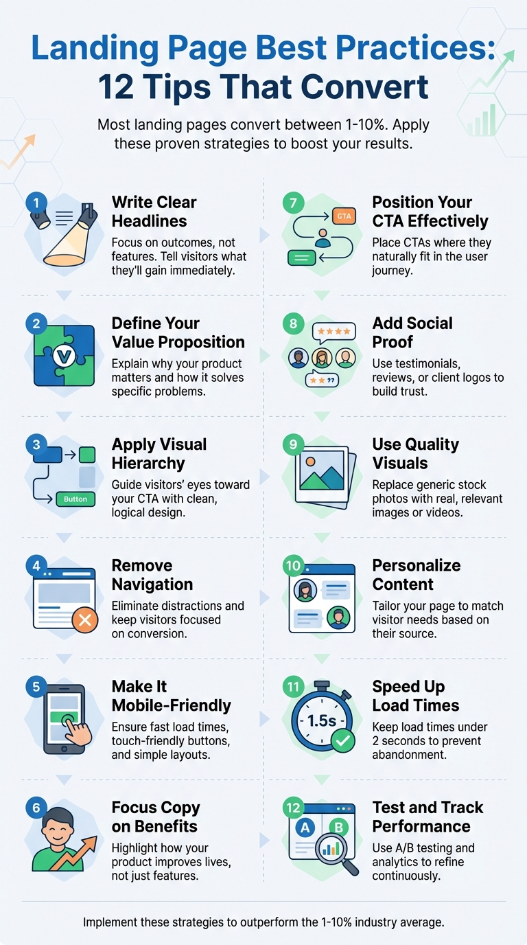
Your landing page is your key to turning visitors into customers. But most landing pages only convert between 1–10%, with many struggling to reach 5%. By making small, targeted improvements, you can significantly boost conversions. Here’s how:
- Write Clear Headlines: Focus on outcomes, not features. Headlines should immediately tell visitors what they’ll gain.
- Define Your Value Proposition: Explain why your product matters and how it solves specific problems.
- Apply Visual Hierarchy: Guide visitors’ eyes toward your call-to-action (CTA) with clean, logical design.
- Remove Navigation: Eliminate distractions and keep visitors focused on your conversion goal.
- Make It Mobile-Friendly: Ensure fast load times, touch-friendly buttons, and simple layouts for mobile users.
- Focus Copy on Benefits: Highlight how your product improves users’ lives instead of listing features.
- Position Your CTA Effectively: Place CTAs where they naturally fit in the user journey, not just "above the fold."
- Add Social Proof: Use testimonials, reviews, or client logos to build trust and reduce skepticism.
- Use Quality Visuals: Replace generic stock photos with real, relevant images or videos.
- Personalize Content: Tailor your page to match visitor needs based on their source or pain points.
- Speed Up Load Times: A slow page kills conversions. Keep load times under 2 seconds.
- Test and Track Performance: Use A/B testing and analytics to refine your page and learn what works best.
These steps can help you design a landing page that converts more visitors. Whether you're a startup or refining an existing page, these proven methods will help you achieve better results.
12 Landing Page Best Practices That Boost Conversions
I Studied 1000 Landing Pages, Here's What Works in 2025
1. Write a Clear Headline
Your headline is your first - and sometimes only - chance to make an impression. With just a few seconds to grab someone's attention, clarity is key. Forget trying to be overly clever; focus on clearly communicating what your product does and who it's for.
Conversion-Focused Design and Copy
A strong unique selling proposition (USP) can increase landing page effectiveness by a whopping 220%. For instance, Slack's headline, "Be more productive at work and less busy," is a great example cited by Landingi. It's straightforward, benefit-driven, and resonates with the audience.
Avoid vague, generic slogans like "Revolutionizing Business Efficiency with AI-Powered Solutions." Instead, zero in on specific, tangible benefits. A headline like "Save 10+ Hours a Week with AI-Powered Marketing Automation" immediately tells visitors what they stand to gain. Webstacks found that headlines focusing on measurable outcomes perform far better than those using abstract messaging.
Alignment with User Pain Points
A great headline speaks directly to your audience's pain points. Take Lemlist's headline: "Write better email campaigns, 10x faster." This directly addresses the frustrations of users struggling with email delivery and personalization.
"If the visitor reads only this text on your page, will they know exactly what you sell?"
– Julian Shapiro, Author, Startup Handbook: Landing Page Copywriting
To test your headline, ask someone unfamiliar with your product to explain what you offer after reading it. If they can't, it's time for a rewrite. Pair your headline with a subheader that expands on the promise or benefit. This combination creates a solid foundation for product validation.
Effectiveness in Product Validation
A compelling headline isn't just about grabbing attention - it’s also a critical tool for product validation. In fact, Shopify Staff found that a strong headline can boost conversions by as much as 307%. They compared two headlines for a portable blender: "Healthy smoothies anytime, without the kitchen mess" vs. "USB-rechargeable 6-blade portable blender." The first, focused on the outcome, significantly outperformed the feature-driven alternative.
"You only have a few seconds to grab your visitors' attention. A clear and compelling headline should communicate your unique value proposition instantly. Prioritize outcomes over features to show users what they'll gain."
– Shopify Staff
Consistency is also key. Make sure your headline aligns with the messaging in the ads or links that brought visitors to your page. Mismatched messaging can confuse users, drive them away, and skew your testing results. Tools like CoSchedule's Headline Analyzer can help you refine your headline, and A/B testing different options will reveal what resonates most with your audience.
2. Define Your Value Proposition
After grabbing attention with a strong headline, the next step is to define your value proposition. This is where you explain why you matter and how your product or service makes a difference. Think of it as a promise that answers the critical question: "Why should I choose you over everyone else?" While the headline hooks your audience, the value proposition dives deeper, showcasing the real benefits you offer.
Conversion-Focused Design and Copy
An effective value proposition isn’t just about describing what you do - it’s about focusing on your customers and the benefits they’ll experience. It’s not a feature list; it’s a clear, compelling explanation of how you solve their problems.
"Your unique value proposition is the heart and soul of your offer. It's the element of your product or service that is most valuable and the most uniquely valuable to your audience."
– Joel Klettke, Founder, Business Casual Copywriting
To craft this effectively, use the "Pain, Claim, Proof" framework:
- Pain: Identify the specific problem your audience is facing.
- Claim: Present your solution in a clear and straightforward way.
- Proof: Back up your claim with data, testimonials, or case studies.
Keep your messaging simple and avoid overwhelming your audience with technical jargon. Focus on the outcomes they care about.
Alignment with User Pain Points
Your value proposition should resonate with your audience’s struggles. Take CQuel, for instance - a commercial real estate company that supports decarbonization efforts. Their messaging highlights how they simplify the often-complicated and stressful process of decarbonization. Instead of dwelling on technology alone, they address the real challenges their audience faces.
Start by identifying the main pain points of your target audience. Then, create messaging that shows empathy and proves you understand their situation. Avoid generic phrases like "innovative solutions" or "cutting-edge technology", which can feel empty when someone is dealing with a pressing issue. Instead, be specific: articulate their problems and present your product as the solution they’ve been looking for.
Effectiveness in Product Validation
A strong value proposition builds trust immediately by clearly communicating what your audience stands to gain. It keeps the focus on what truly matters to them and eliminates confusion by making your value obvious from the start.
"A landing page is about one person: your customer, and the value they can receive."
– Joel Klettke, Founder, Business Casual Copywriting
3. Apply Visual Hierarchy
Once you've crafted a strong headline and a clear value proposition, the next step is to guide users seamlessly toward your call-to-action (CTA) using a well-thought-out visual hierarchy.
Visual hierarchy is all about organizing design elements in a way that naturally directs a visitor's attention to the most important parts of your landing page - ultimately leading them to your CTA. Think of it as a map for your visitor's eyes, helping them focus on what matters without any confusion.
Design and Copy That Drive Conversions
Elements like size, contrast, color, whitespace, and alignment play a big role in drawing attention to your CTA. For example:
- Use bold, larger text for your CTA and a color that stands out sharply against the background.
- Surround important elements with ample whitespace to make them pop and guide the eye naturally.
- Since users often scan pages in an F-pattern, place your headline at the top, benefits along the left, and your CTA where the eye naturally ends up.
By visually emphasizing key details, you reinforce your message and make it easy for visitors to take action.
Simple Steps for Startups
You don't need to be a professional designer to create an effective visual hierarchy. Start by making your CTA button the most eye-catching element on the page. Choose a color that contrasts strongly with the background, and make sure the button is large enough for easy tapping on mobile devices.
Keep distractions to a minimum - every single element on the page should serve your conversion goal. This focused approach ensures your visitors stay on track and aren't pulled in different directions.
Solving the Cognitive Overload Problem
A well-structured visual hierarchy also tackles a common user frustration: cognitive overload. When someone lands on your page, they shouldn't have to guess what to do next. By presenting information in a logical, easy-to-follow way, you reduce friction and help visitors quickly grasp your page's purpose and value. This clarity keeps them engaged and more likely to move toward your CTA without hesitation.
4. Remove Unnecessary Navigation
Your landing page has one primary goal: driving conversions. Every navigation link you include becomes a potential distraction, pulling visitors away from completing the action you want them to take.
Keeping the Focus on Conversions
Unlike your homepage, which serves as a hub for exploring different sections of your website, a landing page needs to stay laser-focused. This means cutting out standard navigation menus, header links, and even logos that could divert attention. A guide from Landingi in August 2025 highlighted that removing full navigation menus created a distraction-free experience, keeping visitors locked in on the conversion goal. Every element on your landing page should work toward supporting that single objective.
Simplifying Execution for Startups
Once you’ve nailed down this principle, implementing it is pretty straightforward. Start by removing the main navigation bar entirely. Instead, weave key details - like answers to common questions, core benefits, and responses to objections - directly into your page's content. If you need to provide extra information, consider adding a secondary call-to-action, such as “Download Product Brochure,” but make sure it doesn’t compete with your primary action.
Addressing Visitor Needs
Most visitors land on your page with one clear problem they’re looking to solve. Navigation menus can slow them down or distract them from understanding your value proposition. By keeping the page streamlined, you minimize friction and guide them toward a single, decisive action. If they need more information, save it for the thank-you page after they’ve converted.
5. Make It Mobile-Friendly
Conversion-Focused Design and Copy
With 187 million active mobile shoppers expected in the U.S. by 2025, making your landing page work seamlessly on smartphones is non-negotiable. Mobile users tend to have shorter, goal-oriented sessions and expect to see your offer immediately. This means your mobile design should emphasize simplicity and feature bold, touch-friendly CTAs tailored for smaller screens. And since 70% of consumers admit that loading time affects their willingness to buy, every second matters when they land on your page via their phone.
Start with a mobile-first design approach, then adapt it for desktop. This ensures the most critical elements - like your headline, value proposition, and call-to-action - are front and center without the need to scroll. A mobile-first strategy sets the stage for a streamlined and effective user experience.
Ease of Implementation for Startups
You don’t need a full development team to create mobile-responsive landing pages. No-code builders with built-in mobile responsiveness let you preview and tweak designs for any screen size. These tools handle the technical complexities, so you can focus on your messaging and testing what drives conversions.
Addressing User Pain Points
Mobile users can be easily discouraged by slow load times, clunky navigation, or lengthy forms. To keep them engaged, your mobile landing page should eliminate these roadblocks. Keep forms short, use large, easy-to-tap buttons, and ensure text is legible without requiring zooming. Also, consistency is key - if someone clicks on a mobile ad promoting a specific feature, that feature should be prominently displayed when they arrive. Addressing these details can make all the difference in keeping potential customers on board.
6. Focus Copy on Benefits
Conversion-Focused Design and Copy
When visitors land on your page, they care about what’s in it for them - not the technical jargon. In fact, focusing on benefits over features can boost conversion rates by up to 40%. Instead of explaining what your product is or does, highlight how it improves your customers' lives.
Take Writer, an AI writing platform, as an example. Rather than bombarding users with technical specs, they focus on outcomes like “Accelerate campaign launches", “Give marketers their creative time back", and “Maintain your ideal level of quality and brand”. These phrases address what marketers truly value - saving time, achieving faster results, and ensuring consistent quality.
"Your customers buy your products or services because of the outcomes, not the inputs that produce them." - KlientBoost
A simple trick to shift your mindset: for every feature, ask yourself, “So what?” Let’s say your product offers oversized storage capacity. The real benefit? Users spend less time managing files and more time being productive. Does automation come with your service? The benefit is that it frees up hours in your customers’ day. Good Eggs, a grocery delivery service, applies this logic masterfully, framing “delivery” as “everything you need, delivered to your door” and “customer service” as “customer service you can count on”.
Ease of Implementation for Startups
Once you grasp the importance of benefits, it’s time to weave them into your copy. Start by listing your product’s features, then write a clear sentence for each explaining how it makes your customers’ lives better. Use direct, conversational language with words like “you” and “your” to help readers picture themselves enjoying the benefits.
For example, if you’re building landing pages with tools like LaunchSignal, this approach makes it easy to test different angles. One version might emphasize time savings, while another focuses on cost reduction. By comparing results, you’ll uncover which benefit resonates most with your audience.
Alignment with User Pain Points
Your visitors are on your page for one reason - they have a problem and need a solution. Instead of diving into the mechanics, show them how you solve their issue. Be straightforward about the benefits.
Take Wix Logo Maker as an example. Their header, “Create a logo that reflects your vision with Wix Logo Maker,” skips the technical details and zeroes in on the benefit. This kind of direct, benefit-driven messaging turns casual browsers into paying customers. By framing every feature as a clear, tangible benefit, you keep your landing page laser-focused on converting interest into action.
sbb-itb-9a9c51d
7. Position Your Call-to-Action Correctly
Conversion-Focused Design and Copy
Where you place your call-to-action (CTA) can make or break your conversion rates. While the old "above the fold" rule still holds some weight, it’s not a one-size-fits-all approach anymore. People are used to scrolling, and if your CTA shows up too early - before they’ve connected with your message - it might fall flat.
The sweet spot for your CTA depends on the flow of your page. For shorter pages, placing it above the fold works well. On longer pages, consider repeating it at natural stopping points - like after you’ve explained your value or shared some compelling social proof. This way, users don’t have to hunt for it by scrolling back up, keeping the action front and center.
When crafting the CTA itself, choose action-driven verbs like "Get", "Start", "Join", or "Create." These words clearly spell out the next step and inspire action. Also, frame your CTA around the benefit to the user, not the cost. For instance, "Start Getting Clients" feels more rewarding and direct than "Get My Free Resource".
Ease of Implementation for Startups
You don’t need a big budget or advanced tech skills to optimize your CTA placement. Thanks to no-code platforms like LaunchSignal, you can experiment with different designs and placements quickly. For example, you can create multiple landing page versions, each with CTAs in slightly different spots, and see which one drives more email signups or form completions.
Here’s a practical example: one company saw a 46% increase in conversions by combining visually distinct CTAs with plenty of whitespace. You can try this too - make sure your CTAs stand out, leave enough space around them for clarity, and ensure they’re easy to tap on mobile. Adding directional cues, like arrows, can also guide users’ eyes to the action. By following these design principles, you can naturally lead users to take the next step without overwhelming them.
8. Add Social Proof
Conversion-Focused Design and Copy
Social proof taps into our natural desire for validation. When someone visits your page, they often come with a healthy dose of skepticism. Showing them that others have already trusted and benefited from your product helps dissolve that doubt quickly. In fact, research highlights that 88% of consumers trust online reviews as much as personal recommendations, and 72% rely on testimonials to build trust.
The trick is to make your social proof targeted and meaningful. General or vague endorsements don’t do much to sway decisions. As Joel Klettke, Founder of Business Casual Copywriting, aptly explains:
"You can use testimonials in areas of friction (like near pricing) to help add a shot of credibility."
Strategically place testimonials where they matter most - near pricing details or call-to-action buttons. Use real names, photos, and specific claims to make them relatable and credible. These small details can make a big difference in tipping the scales toward conversion.
Easy Wins for Startups
Even if you’re just starting out, you don’t need a massive customer base to showcase effective social proof. Start small. Use feedback from early users, display recognizable client logos, or include simple statements like “Trusted by 100+ early adopters.” Authenticity often trumps polish - genuine testimonials can be far more persuasive than overly polished marketing copy. Reach out to your first customers and ask for their honest input; many will be happy to share their experience.
If you’re looking for tools to get started, platforms like LaunchSignal can help. They allow you to gather real user feedback and testimonials from day one, turning early interactions into valuable assets for your landing page. You can also use “featured on” badges or highlight partnerships with well-known brands. For instance, TyresOnTheDrive paired testimonials with prominent brand logos, while Investing Shortcuts combined “featured on” logos with a notable quote to boost conversions by 51.32%. These strategies not only add credibility but also reinforce the value of your offering.
Addressing User Concerns Directly
To make your social proof truly effective, align it with the specific problems your audience is trying to solve. For example, if your customers are worried about setup time, feature a testimonial like, “We were up and running in just 24 hours.” If cost is a concern, place reviews near pricing sections that highlight value and ROI. This approach reassures potential buyers that others with similar concerns have found success with your product, making it easier for them to take the next step.
9. Use Quality Images and Graphics
Conversion-Focused Design and Copy
The right visuals can amplify your message and make your landing page more effective. Research shows that visuals grab attention 60,000 times faster than text. This means the images and graphics you use aren't just decorative - they play a critical role in driving conversions. High-quality visuals can quickly highlight your value, support your headline, and make your offer feel real and relatable.
Relevance is key. Every image should directly tie into your message and help visitors imagine how your product or service benefits them. Avoid generic stock photos - like people shaking hands or pointing at laptops - as they can feel impersonal and even reduce trust. Instead, opt for visuals that connect authentically with your audience. Use real screenshots of your product, photos of your team or customers, or examples of your product in action. These kinds of visuals make your offer more relatable and trustworthy. Additionally, incorporating video content can further engage visitors and help them quickly grasp your value.
Ease of Implementation for Startups
Creating impactful visuals doesn’t have to break the bank. Start with real product screenshots, quick recordings, or even photos taken with a smartphone. Authenticity often resonates more than over-polished visuals. Show real interactions with your product or genuine feedback from users.
For startups working with limited resources, focus on hero images - the main image above the fold that sets the tone for your page. Pair this with before-and-after visuals or short demo videos (keep them under 90 seconds) to highlight how your product transforms a problem into a solution. These visual elements simplify complex ideas and help potential customers see themselves achieving similar results.
Alignment with User Pain Points
To truly connect with your audience, tailor your visuals to address their specific concerns. For example, if your users worry about complexity, showcase a clean, intuitive interface. If they're focused on results, include clear before-and-after comparisons backed by real data.
"You need to write content that speaks to local habits and concerns, not just generic benefits." – Adrian Nikolov, Head of SEO & Content Marketing at MobiSystems
This principle applies to visuals, too. Replace generic images with ones that resonate with your audience's local context and unique challenges.
Finally, ensure your visuals are mobile-friendly. With over half of all online searches now happening on smartphones and tablets, your images must load quickly and display properly on smaller screens. Use responsive design, compress images to maintain quality without slowing down load times, and include descriptive alt-tags. These steps not only improve accessibility for visually impaired users but also help search engines better understand your content.
10. Personalize Content for Visitors
Conversion-Focused Design and Copy
Shaping your landing page to connect with specific audience segments can make a huge difference in how visitors engage with your content. When people feel like your page speaks directly to their needs, they're much more likely to take action. Start by analyzing where your visitors are coming from. For instance, someone clicking on an ad about time management likely has different priorities than someone arriving from a post about team productivity. Adjusting core elements like the headline or hero image can make your page feel more relevant, which naturally grabs attention and encourages interaction. This approach not only captures interest but also makes customization easier to manage.
Simplicity for Startups
You don’t need to invest in expensive tools or advanced coding to personalize effectively. A practical way to get started is by creating multiple versions of your landing page for different audience groups or traffic sources. Many landing page builders let you duplicate and tweak pages quickly, so even startups with tight budgets can manage this without hassle. For B2B startups, using IP-based tools to tailor headlines and case studies to the visitor's industry can go a long way. It shows you understand their unique challenges and builds trust.
Addressing User Pain Points
Personalization works best when it ties your product’s features to the specific challenges your audience faces. For example, emphasize ease of setup for visitors concerned about complexity, or highlight cost savings for those focused on ROI. When your messaging reflects their concerns, visitors feel acknowledged and are more likely to stay engaged.
Testing for Product Validation
Personalized pages do more than just grab attention - they also help validate your product in the market. By creating variations that spotlight different benefits, you can test which messages resonate most. A/B testing these tailored pages gives you concrete data on what drives conversions, helping you refine your product’s positioning and focus on the features that matter most. Personalization isn’t just about improving engagement - it’s a powerful tool for shaping your product and boosting long-term results.
11. Speed Up Page Load Times
Conversion-Focused Design and Copy
Page speed isn’t just a technical detail - it’s a dealbreaker. A one-second delay can slash your conversion rate by 7%, and 53% of mobile users will abandon a page if it takes more than three seconds to load.
"If your landing page is slow to load, then it's more likely that a user will bounce." – Josh Gallant, Founder of Backstage SEO
The numbers don’t lie: users are 32% more likely to leave at the three-second mark, and this skyrockets to 106% at six seconds. On the flip side, pages that load in 0–2 seconds see the best conversion rates. In short, improving load times is a direct route to higher conversions.
Easy Wins for Startups
You don’t need a massive budget to speed up your site. Simple fixes like optimizing images, removing unnecessary scripts, and using a CDN can make a big difference. Plus, many landing page builders now come with built-in tools to handle tasks like minifying CSS and JavaScript, reducing redirects, and enabling browser caching. These features let startups focus on crafting their message while the platform takes care of performance.
Addressing Mobile User Expectations
Mobile users are impatient - bounce rates on mobile devices can hit 60.19%, compared to 50.33% for desktops. A fast, mobile-first design is non-negotiable. By keeping your content streamlined and prioritizing speed, you create a seamless experience that keeps users engaged and drives conversions.
Impact on Product Validation
Page speed isn’t just about keeping users happy - it directly affects your ability to validate your product. For every extra second of load time, you lose 12% of potential conversions. Slow pages don’t just frustrate visitors; they also skew critical metrics like email signups, survey completions, or checkout simulations. If your page is slow, you’re not getting an accurate read on your product’s potential.
12. Test and Track Performance
Conversion-Focused Design and Copy
Creating a landing page is just the beginning - it’s where the real work starts. A/B testing takes the guesswork out of the equation by providing solid data to help you understand what works best for your audience. By comparing different versions of your page, you can pinpoint what resonates most with visitors. Even small tweaks, like changing a headline or button color, can lead to noticeable improvements in conversion rates.
Start by focusing on one element at a time - whether it’s your headline, call-to-action (CTA) text, or hero image. Then, split your traffic between two versions and let the data guide you to the better-performing option. Analytics tools track essential metrics like form submissions, downloads, and purchases. As Halo Lab aptly states:
"What cannot be measured cannot be controlled"
This data-driven process not only fine-tunes your landing page but also helps validate your business assumptions.
Simplified Tools for Startups
For startups, modern landing page builders make testing and tracking easier than ever. Many platforms come with built-in A/B testing and analytics features, enabling quick experiments without requiring advanced technical skills. Tools like Google Analytics help you set up tracking, monitor performance, and identify areas that need improvement.
Set SMART goals (Specific, Measurable, Achievable, Relevant, Time-bound) for your landing page. Track your results, implement the winning variation, and move on to the next test. This step-by-step approach ensures continuous improvement without overwhelming your team.
Validating Your Product Through Testing
Performance tracking isn’t just about optimizing your landing page - it’s also a powerful tool for validating your product. Systematic testing of elements like headlines, copy, and visuals ensures that every change enhances your page’s effectiveness. But beyond optimization, your landing page becomes a proving ground for critical business ideas.
For startups exploring new product concepts, this process answers key questions: Are you addressing a genuine problem? Is your offer compelling enough? Are you targeting the right audience? A/B testing provides real-world insights from potential customers, helping you move beyond assumptions and make informed decisions.
Conclusion
Creating high-converting landing pages isn't about luck - it’s about following proven strategies that encourage visitors to take action. This article's 12 tips provide a solid framework, covering everything from writing clear headlines and showcasing your value proposition to optimizing for mobile users, placing your call-to-action effectively, and testing performance consistently. When combined, these elements help visitors quickly grasp your product's benefits, build trust, and make their journey to conversion as straightforward as possible.
By putting these strategies into action, you'll position your landing page to outperform industry benchmarks, turning more visitors into customers, email subscribers, or product testers. Think of your landing page as a "virtual laboratory" where you can experiment, tweak, and validate ideas based on how users actually behave.
Remember, optimizing a landing page isn’t a one-and-done task. Market trends change, and customer preferences shift, so ongoing adjustments are essential. This is why tracking and testing are so important - they transform your landing page into a dynamic tool that evolves and improves over time.
For businesses looking to simplify this process, tools like LaunchSignal can make a big difference. It offers ready-to-use landing page templates and built-in features for collecting user feedback, such as email signups, questionnaires, and sample checkouts. Plus, its analytics dashboard helps you track performance. With a one-time fee of $99, you get access to three active validation pages and 10,000 monthly views - no coding or design expertise required. It’s an efficient way to test multiple ideas and make data-driven decisions.
FAQs
What’s the best way to personalize landing page content for different audience groups?
To make your landing page more personalized, begin by collecting first-party data to get a clear picture of your audience's demographics, behaviors, and preferences. Use this information to divide your audience into specific groups, then tweak elements like headlines, visuals, and calls-to-action (CTAs) to better connect with each segment.
Leverage dynamic content tools to automatically show customized content based on who’s visiting your page. Continuously test and fine-tune your strategy to keep your messaging relevant and effective. Personalization not only enhances the user experience but also strengthens trust and engagement with your audience.
What’s the best way to position call-to-action (CTA) buttons on a landing page?
To get the most out of your CTA buttons, position them where they're impossible to miss - like above the fold, at the end of important sections, or surrounded by whitespace to naturally draw the eye. Choose contrasting colors that pop against the background, and make sure the text is clear and action-driven with phrases like "Get Started" or "Sign Up Now" that inspire immediate action.
Design matters, too. Buttons should look clickable, so consider adding subtle effects like shadows or gradients to give them a dimensional feel. And don’t forget to experiment - test different placements, colors, and wording to see what connects best with your audience.
Why does page load speed matter for landing page conversions?
Page load speed is a key factor in how well a landing page performs. When a page takes too long to load, visitors can quickly become annoyed, often leaving before engaging further. This leads to higher bounce rates and fewer conversions. On the flip side, faster-loading pages offer a smoother experience, help build trust, and encourage visitors to stick around and take action.
Studies reveal that users expect a page to load in three seconds or less. Even a one-second delay can hurt engagement and lower conversion rates. Focusing on speed doesn’t just keep users happy - it also ensures your landing page delivers the results you’re aiming for.
Start validating ideas in minutes not days
Create high-converting landing pages. Test with real users. Get purchase signals. Know what to build next.
Visit LaunchSignal