December 21st, 2025
Low Conversion Rates: 5 Quick Fixes for Landing Pages
Fix low landing-page conversions with five targeted changes: clearer CTAs, faster load times, clearer messaging, simpler forms, and mobile optimization.
Warren Day
Struggling with low landing page conversions? Here’s the good news: small, targeted changes can double your results without increasing traffic or ad spend.
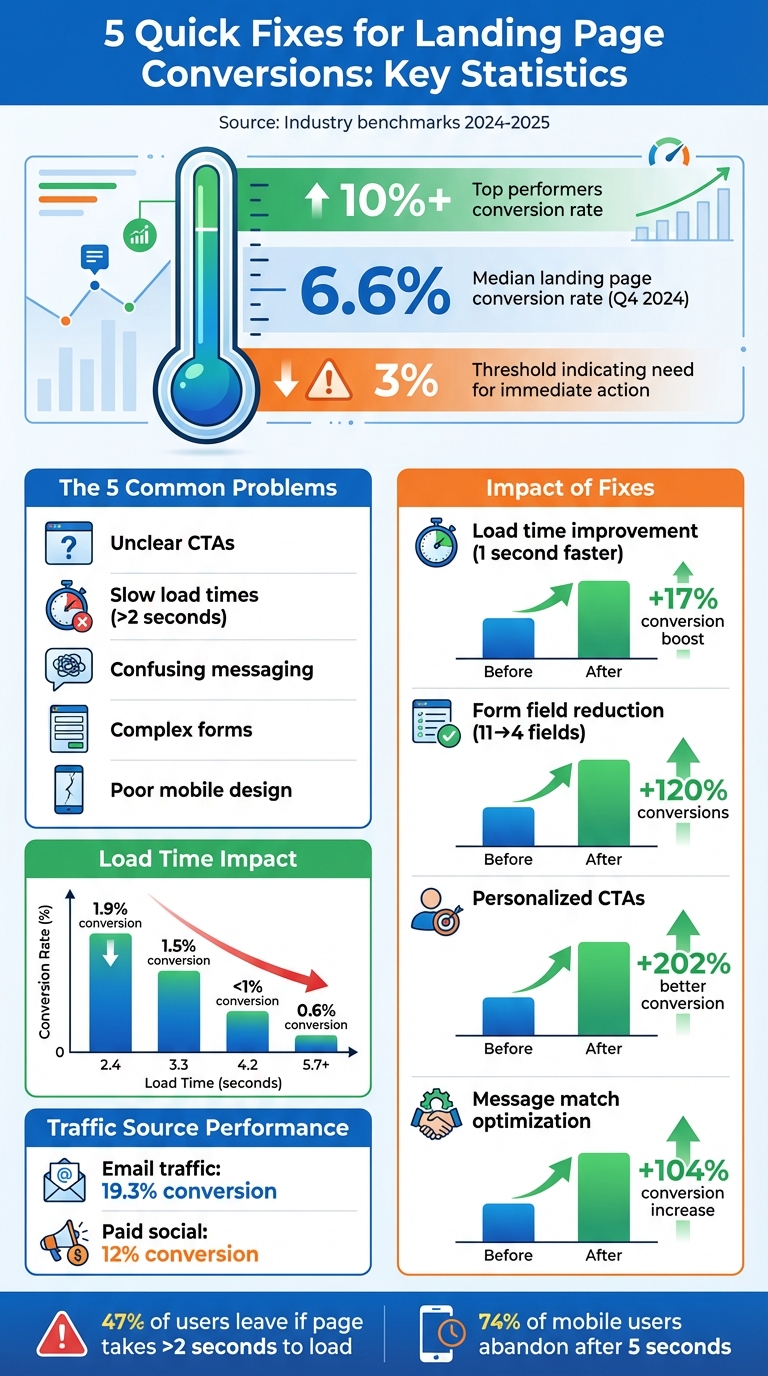
The most common culprits behind low conversion rates include:
- Unclear CTAs: Confusing or hard-to-find calls-to-action.
- Slow load times: Pages taking longer than 2 seconds to load.
- Confusing messaging: Headlines and copy that don’t match user intent.
- Complex forms: Lengthy or unnecessary fields that drive users away.
- Poor mobile design: Pages that aren’t optimized for mobile users.
Median landing page conversion rates hover around 6.6% (Q4 2024), but top performers hit 10% or more. If your page is below 3%, it’s time to act. Simple fixes like tweaking your CTA, speeding up load times, or clarifying your message can drive immediate improvements.
Key takeaway: Start small. Focus on one issue at a time - like streamlining your forms or testing a new headline - and measure the impact. Even a 1-second faster load time can boost conversions by up to 17%.
Let’s break down the five fixes that can help turn visitors into customers.
Landing Page Conversion Rate Statistics and Impact of Optimization
How to Find Conversion Problems with Analytics
Pinpointing where users drop off in your analytics is a crucial step toward improving your landing page performance. Analytics tools can reveal what’s working and what’s falling short. The trick is knowing which metrics to track and how to interpret them.
Track Metrics to Spot Weak Points
Keep an eye on metrics like conversion rates, bounce rates, and scroll depth. These will give you a quick snapshot of how well your page engages visitors and where they lose interest.
In Google Analytics 4, head to Reports > Life cycle > Engagement > Landing Pages to review these metrics for your landing pages. Look for patterns. For instance, if visitors leave almost immediately, it might point to an issue with your headline or hero section. On the other hand, if users engage with most of your content but fail to convert, your call-to-action (CTA) may need a rethink.
Tools like LaunchSignal's analytics dashboard automatically track these metrics, helping you quickly identify which landing page elements are performing well and which need attention.
Next, segment your traffic to find mismatches between what users expect and what your page delivers.
Identify Disconnects Between Traffic and Messaging
Not all traffic sources perform the same. Breaking down your metrics by source can uncover "message match" issues - where your ad promises one thing, but your landing page delivers something else. For example, while email traffic tends to convert at an average rate of 19.3%, paid social traffic typically converts at about 12%. If your Facebook ads are underperforming, it could be because the messaging in your ad doesn’t align with what users see on your landing page.
"When you don't have message match in your visitor journey, people get confused or frustrated - and then they bounce." – Unbounce
To address this, ensure your headline, visuals, and tone match the messaging from the ad or email that brought visitors to your page. Use GA4’s source segmentation to identify channels with higher bounce rates, and review those campaigns for consistency.
Run A/B Tests on Key Elements
Once you’ve identified problem areas, test different versions of key elements to see what resonates with your audience. A/B testing is a method where you change one element at a time - like your headline, hero image, or CTA button - and compare the performance of the original (Version A) to a variation (Version B).
To prioritize your tests, use the PIE framework: Potential (how much improvement is possible), Importance (how critical the page is), and Ease (how simple the test is to implement). Focus on high-impact changes first. For example, testing an entirely new value proposition often yields more actionable insights than minor tweaks like changing button colors.
Run each test for at least two weeks to account for traffic fluctuations, and only declare a winner when you achieve 90–95% confidence in the results. Tools like LaunchSignal simplify the process by allowing you to compare multiple landing page variations side by side, helping you figure out which messaging truly connects with your audience.
Fix Your Call-to-Action Clarity and Placement
Your call-to-action (CTA) is the bridge between sparking interest and driving conversions. If it’s confusing, hard to find, or competing with other elements, you’re likely losing potential customers. The solution? Keep it simple - focus on a single, clear action and make it stand out.
Use One Primary CTA
Too many CTAs can overwhelm visitors and cause hesitation. Stick to one clear, action-oriented goal that aligns with your page’s purpose - whether that’s signing up for a trial, downloading a guide, or booking a demo.
"The only choices a landing page should offer a user is to move forward through the conversion process or to leave." – Moz
Eliminate distractions like secondary navigation and competing options. Avoid vague phrases like "Submit" or "Click Here" and replace them with specific, action-driven language such as "Get My Free Guide", "Start Your 14-Day Trial", or "Claim Your Discount". Personalizing your CTA can pay off big: personalized CTAs convert 202% better than generic ones.
Where to Place Your CTA
Placement is just as crucial as clarity. Your primary CTA should be above the fold - visible without scrolling - so it grabs attention immediately. For instance, ArchiveSocial repositioned their CTA above the fold and saw a 101% increase in clicks on their lead form.
On longer pages, repeat your CTA after key sections and at the bottom to reach users who need more information before taking action. Sticky CTAs - buttons that stay fixed at the top or bottom of the screen - are another great way to keep the action accessible as users scroll.
Design CTAs for Mobile and Desktop
CTA design should be tailored for both desktop and mobile users. Buttons need to be at least 44×44 pixels for easy tapping, and high-contrast colors can help them stand out. For example, an orange button on a blue background is instantly eye-catching. Surround the CTA with white space to make it pop and avoid blending into nearby elements.
On mobile, focus on brevity since screen space is limited. On desktop, you can include slightly longer, more descriptive text.
| Element | Desktop Best Practice | Mobile Best Practice |
|---|---|---|
| Button Size | Standard clickable size; high contrast | Minimum 44×44 pixels for easy tapping |
| Placement | Above the fold; end of content | Above the "thumb scroll" zone |
| Copy Length | Slightly more descriptive | Keep it brief |
| Navigation | Remove top/side nav bars | Use a single-column layout; no menus |
Speed Up Page Load Times and Mobile Performance
A slow-loading landing page can seriously hurt your conversions. Research shows that improving load time by just one second can increase conversion rates by up to 17%. On the flip side, every additional second of delay can lead to a 12% drop in conversions. People expect websites to load in under 2 seconds, and nearly half - 47% - will leave if it takes longer.
The stakes are even higher for mobile users. A staggering 74% of mobile visitors will abandon a page if it takes more than 5 seconds to load. With mobile devices accounting for over 62% of global web traffic, optimizing for speed is no longer optional. For instance, Walmart found that every second shaved off their load time resulted in a 2% boost in conversions, while COOK achieved a 7% increase in conversions by reducing load time by just 0.85 seconds.
Make Your Page Load Faster
Strive to keep your page load time at 2 seconds or less. To meet Google's Core Web Vitals standards, aim for:
- Largest Contentful Paint (LCP): Under 2.5 seconds
- Interaction to Next Paint (INP): 200 milliseconds or less
- Cumulative Layout Shift (CLS): 0.1 or below
These aren't just technical metrics - they directly impact results. For example, Rakuten 24 optimized their Core Web Vitals and saw a 33.13% jump in conversion rates and a 53.37% increase in revenue per visitor.
"If your site does not load fast enough, prospects will leave before seeing your offer." – Niko Kaleev, User Experience Content Expert, NitroPack
Start with image optimization. Images are often the heaviest part of a webpage, which typically averages 2,486KB. Use modern formats like WebP or AVIF to reduce file sizes while maintaining quality. Implement lazy loading so images below the fold load only when needed.
Other quick fixes include:
- Minifying code: Remove unnecessary characters from HTML, CSS, and JavaScript.
- Browser caching: Speed up load times for returning visitors.
- Using a CDN: Deliver files from servers closer to your audience.
Once your page is fast, shift your attention to creating a mobile-first design that enhances usability.
Design for Mobile Users First
Mobile optimization involves more than just speed - it’s about creating a seamless and intuitive experience. Start with a mobile-first approach and then adapt for desktop.
- Simplify layouts: Use a single-column design to keep users focused and scrolling smoothly.
- Button size: Make buttons at least 44×44 pixels (around 0.5 inches) for easy tapping.
- Readable text: Set body text to at least 16 pixels so users don’t need to zoom.
Test your landing page on popular U.S. devices and connection speeds. Tools like Google PageSpeed Insights and Pingdom can help identify problem areas. Additionally, use sticky CTAs that stay visible as users scroll, ensuring your call-to-action is always within reach.
| Load Time | Conversion Rate (mPulse Mobile Study) |
|---|---|
| 2.4 seconds | 1.9% |
| 3.3 seconds | 1.5% |
| 4.2 seconds | <1% |
| 5.7+ seconds | 0.6% |
sbb-itb-9a9c51d
Clarify Your Messaging and Value Proposition
Your landing page has just 8 seconds to grab a visitor's attention and convince them they’re in the right place. If your message doesn’t quickly communicate your value, they’ll leave. While the average landing page converts at 2.35%, the top 25% achieve conversion rates of 5.31% or more. The difference often comes down to clear, effective messaging.
The problem isn’t always what you’re saying - it’s how you’re saying it. Many landing pages bury their value proposition in confusing jargon. Instead, your hero section should clearly explain what your product is, how it helps, and what action visitors should take next.
Build an Effective Hero Section
Think of your hero section as a bold, benefit-driven billboard. Start with a headline that focuses on outcomes, not just descriptions. For example, instead of writing "Automated Reporting Software", try something like "Save 5 Hours of Manual Work Every Week".
"If we want to try and squeeze out a little more CVR lift, I've found it helps to orient the copy to focus on the benefits first and the features second." – Cyan Zhong, Senior Premium Content Strategist, HubSpot
Follow your headline with a subheadline that tackles a specific pain point or provides additional context. Then, use three to five concise bullet points to highlight what sets you apart - emphasizing benefits over features. Keep the section easy to scan with bold typography for the main headline, and avoid distractions like navigation bars or footers that could pull attention away from your call-to-action.
For inspiration, look at Duolingo’s 2024 hero section, which featured the headline: "The free, fun, and effective way to learn a language!" Paired with vibrant visuals, it immediately reassured users that they were in the right place. Similarly, Calm used a clear headline and an eye-catching "40% off" banner to create urgency and reinforce their value proposition.
Match Copy to User Intent
If someone clicks an ad promising "25% off", that discount should be front and center on your landing page. This alignment, known as message match, is crucial for building trust. When your headline, visuals, and offer match the ad or link that brought visitors to your page, you eliminate confusion and keep them moving toward conversion.
For example, in early 2025, the travel company Going boosted its homepage conversion rate by 104% month-over-month simply by tweaking the wording in its call-to-action. Similarly, HubSpot CRO strategist Rebecca Hinton ran an A/B test in 2024, adjusting the layout of a landing page, which led to a 20% increase in conversions.
"One of the keys to creating landing pages that convert is to match the content of the page to the user intent." – Ben Young, Senior Marketing Manager of Conversion Rate Optimization, HubSpot
Tailor your tone and layout to the traffic source. For instance, if visitors come from a LinkedIn ad targeting professionals, use a formal tone and highlight premium quality. If they arrive via a Facebook ad offering a quick solution, focus on simplicity and speed. Design for "scanners" by using bold headlines, clear subheaders, and bullet points instead of dense text.
Use Feedback to Improve Messaging
Your first draft is rarely perfect. Use customer feedback to fine-tune your message. Ask visitors directly on social media about their concerns or pain points, and run usability tests to understand why they behave the way they do.
Tools like LaunchSignal make gathering feedback simple. Add a short questionnaire to your landing page asking visitors what they were looking for, what questions they still have, or what’s stopping them from converting. This type of qualitative data can uncover common objections - like pricing concerns, usability doubts, or support issues - that you can address in your copy or FAQ section.
For example, if users frequently mention uncertainty about pricing, add a clear pricing breakdown above the fold. If they’re confused about how your product works, include a short explainer video or diagram to clarify. By listening to your audience and iterating based on their input, you can ensure your messaging resonates and drives action.
Simplify Forms and Conversion Flows
Making your conversion process smoother can significantly improve results. Complicated forms often drive users away - 27% of people abandon forms they find too lengthy. Every extra field adds to this risk. But here’s the upside: simplifying forms can yield big wins. Back in 2011, Expedia boosted its annual profits by $12 million just by removing one unnecessary field from its checkout form.
Remove Unnecessary Form Fields
Take a hard look at your forms and ask: Is this field absolutely necessary? A fintech campaign managed by HubSpot found that users were fine sharing their email and company name but balked at entering their mobile number. Removing that single field led to an immediate spike in conversions. In fact, trimming form fields from 11 to 4 can increase conversions by 120%. Even cutting fields from six to three can result in a 40% boost.
"The more form fields your visitor has to fill out, the more friction they feel, and the less likely they are to convert." – Brian Massey, Founder and Conversion Scientist, Conversion Sciences
To make the process even smoother, use inline validation to catch errors as users type, instead of waiting until they hit "Submit." For sensitive fields like phone numbers, add microcopy explaining why the information is needed. This transparency can build trust and reduce hesitation. Another tip? Use progressive profiling - collect the most critical details upfront and ask for additional information later.
Make Forms Work Better on Mobile
Mobile users face unique obstacles: small screens, tricky scrolling, and tiny buttons that make typing feel like a chore. To improve mobile usability, ensure buttons and form fields are at least 44×44 pixels - this size fits the average fingertip. Break up long forms into multi-step flows using the "breadcrumb technique", where users answer one or two questions per screen while a progress bar shows how far they’ve come.
Enable autofill to minimize typing for returning users. Add a sticky call-to-action (CTA) that stays visible as users scroll, so they can easily complete the form whenever they’re ready. Also, position key buttons within the "thumb zone" - the area most accessible to a user’s thumb - to make interactions easier.
Once your mobile forms are optimized, you can take the next step: testing demand before committing to full-scale implementation.
Test Purchase Intent with Fake Checkouts
Before investing in a complex payment system, test user interest with a fake checkout. This approach simulates a purchase flow, allowing you to measure demand. Tools like LaunchSignal let you create a realistic checkout experience where users can "add to cart" and proceed through the steps. When they reach the final stage, you collect their email and let them know they’ll be notified when the product is ready.
This strategy works especially well for startups looking to validate product demand. You can track how many users complete the simulated checkout, pinpoint fields that cause drop-offs, and uncover common objections. Use these insights to refine your offer, adjust pricing, and tweak messaging before diving into full development.
Conclusion: Apply These Fixes to Boost Conversions
You now have five solid strategies to breathe new life into underperforming landing pages: analyze your data to pinpoint issues, refine your CTAs, improve page load speed, clarify your messaging, and simplify your forms.
The median landing page conversion rate across industries is just 6.6%, which shows how many pages fail to capture their full potential. However, small, focused adjustments can lead to noticeable improvements.
Here’s a quick refresher before you take the next step: Start with the easy wins. Work on speeding up your page and refining your CTA text before considering a complete overhaul. Faster load times reduce visitor drop-offs, while sharper CTAs grab attention. Use analytics to identify where users are leaving - if they’re not reaching your CTA, your messaging might need fine-tuning. If they’re abandoning your form, it’s time to cut out unnecessary fields.
"Guessing is expensive. Testing is profitable." – Josh Gallant, Founder of Backstage SEO
Remember, optimization isn’t a one-and-done task. User behavior evolves, competitors adapt, and what worked last month might not work today. Make testing a habit. Experiment with one element at a time - whether it’s a headline, button color, or form layout - so you can pinpoint what truly makes a difference. This ongoing approach ensures you’re always improving.
For those ready to dive deeper, tools like LaunchSignal simplify the testing process. With features like test landing pages, fake checkouts to gauge demand, and analytics to track performance, it’s easier than ever to optimize without needing technical skills. Their Lifetime plan, priced at $99, includes three active validation pages, 10,000 monthly page views, email capture, questionnaires, and more.
Pick one strategy, put it into action, and monitor the results. With consistent effort, you’ll see your conversion rates - and revenue - start to climb.
FAQs
How can I figure out which part of my landing page is lowering conversions?
To pinpoint what’s dragging down your conversions, start by diving into your data. Pay attention to metrics like bounce rate, exit rate, and click-through rates. These numbers can offer clues about where users are losing interest or abandoning your page. Tools like heatmaps can also provide a visual representation of where users are clicking - or not clicking - so you can identify problem areas.
Once you’ve spotted potential issues, run A/B tests to experiment with changes. Tweak one element at a time, such as the headline, call-to-action (CTA), or imagery, and compare the results. This method helps you see which adjustments have the biggest impact on conversions.
Another useful approach is auditing your landing page. Ask yourself a few critical questions:
- Is the value proposition immediately clear?
- Does the page deliver on the promises made in your ad?
- Is there a single, obvious action for users to take?
If you answer "no" to any of these, prioritize fixing those areas.
Finally, don’t underestimate the power of direct user feedback. Use surveys or run usability sessions to hear what’s confusing or frustrating for your audience. Their input can highlight issues you might not have noticed. After making changes, test again to confirm your updates are moving the needle.
How can I improve the performance of a mobile landing page?
To make your mobile landing page perform better, focus on creating a smooth and user-friendly experience designed specifically for mobile devices. Start by ensuring the page loads fast - compress images, enable browser caching, and use lightweight frameworks to speed things up. A responsive design is essential, featuring a clean, vertical layout that aligns with natural scrolling habits and avoids unnecessary clutter.
Your call-to-action (CTA) should be clear and easy to find. Place it near the top of the page, use large, touch-friendly buttons, and make sure it stands out visually. Keep your copy short and engaging, emphasizing your value proposition within seconds. Simplify forms by reducing the number of fields to make them quick and easy to complete. Adding trust signals, like security badges or brief customer testimonials, can also help build credibility and encourage users to take action.
Don't forget to regularly run A/B tests on elements like headlines, CTAs, and form lengths to see what resonates most with your audience.
By focusing on speed, simplicity, and usability, you can turn your mobile landing page into a powerful tool for driving conversions in the U.S. market.
How can A/B testing improve landing page conversions?
A/B testing is a powerful way to find out which version of a landing page works best by comparing two or more variations. By dividing your website traffic between these versions - commonly referred to as Variant A and Variant B - you can analyze how specific tweaks, such as changes to headlines, images, button text, or the overall layout, influence user behavior and drive conversions.
This approach takes the guesswork out of decision-making, allowing you to rely on solid data. Testing one element at a time lets you steadily improve key metrics like click-through rates, lead generation, or sales. Even minor adjustments can lead to significant gains over time, potentially doubling conversion rates or boosting revenue - all without increasing your ad budget. The insights you gather from these experiments can also inform future updates, setting the stage for ongoing improvements to your landing pages.
Start validating ideas in minutes not days
Create high-converting landing pages. Test with real users. Get purchase signals. Know what to build next.
Visit LaunchSignal