December 26th, 2025
How To Validate Product Ideas With Landing Pages
Test product demand with landing pages: craft a clear value prop, drive targeted traffic, capture signups or fake checkouts, and iterate with analytics.
Warren Day
Landing pages are a quick and cost-effective way to test product ideas before investing time and money into full development. Instead of building an entire product, you can create a simple webpage to showcase your idea, attract visitors, and measure interest through actions like email signups or pre-orders. This method has worked for companies like Robinhood and DoorDash, helping them confirm demand early on.
Key Takeaways:
- Why Use Landing Pages? Quickly gauge market interest with minimal investment.
- What to Aim For? A 25% conversion rate and 100–200 signups indicate strong interest.
- How to Start? Define your value proposition, build a page using tools like LaunchSignal, and track metrics like conversion rates and bounce rates.
- Validation Tactics: Use email forms, questionnaires, and "fake checkouts" to measure real user commitment.
- Next Steps: Analyze results to refine your idea or pivot if necessary.
This approach saves time, reduces risk, and ensures you're building something people actually want.
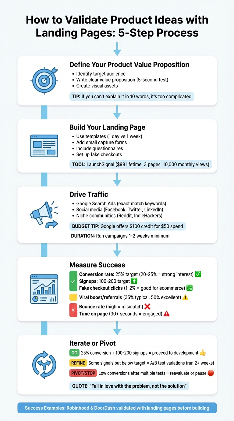
5-Step Landing Page Product Validation Process
Step 1: Define Your Product Value Proposition
Think of your product's value proposition as the heart of your landing page. Without it, your message won’t resonate - it’s like a billboard in a language no one understands. To grab attention and keep it, you need to clearly communicate the problem your product solves and why it matters. Start by identifying exactly who benefits from your solution and why they need it.
Identify Your Target Audience
You can’t write effective copy if you don’t know who you’re talking to. Take time to understand your audience by digging into their motivations and challenges. Conduct user interviews to uncover what really drives them, and use social listening tools on platforms like Twitter, Reddit, and Instagram to observe their conversations. When you start getting signups, skip the generic automated emails. Instead, send personal messages asking what drew them to your product and what problems they’re trying to solve. Rob Fitzpatrick’s The Mom Test suggests focusing on specific challenges during these conversations, rather than fishing for validation of your ideas.
Write a Clear Value Proposition
Your headline has just 5 seconds to make an impression. Keep it simple and direct. A strong value proposition should address three key elements: the problem you’re solving, the benefits you offer, and how your solution works. Focus on the results your audience wants, not just the features of your product. For example:
- Instead of saying, "Revolutionary ride-sharing technology", go with, "We’ll pick you up, wherever you are."
- Instead of "Work faster", try, "Automate client scheduling in seconds."
A good test for clarity is the "Mother Test": if you can’t explain your product to someone outside your field in plain language, your message might be too complicated. Aim to distill your pitch into a 30-second explanation - or better yet, a 10-word headline.
Here’s a great example: In 2013, Saxo Bank refined its headline and saw impressive results - a 99.4% boost in trial signups and a 48.2% drop in cost-per-conversion.
Create Visual Assets
Visuals can often communicate your idea faster than words. Even if your product is still in development, use mockups, wireframes, or renders to help visitors picture it in action. For software, show key interfaces; for physical products, use lifestyle images. Western Rise, for instance, uses bold visuals like an urban cyclist to help customers imagine themselves using their product. Maven, on the other hand, features a hero image of its diverse female staff to quickly establish trust. These visuals don’t just complement your message - they amplify it.
Step 2: Build Your Landing Page with LaunchSignal
Now that you’ve nailed down your value proposition in Step 1, it’s time to make your idea tangible with a live landing page. The best part? You don’t need to be a coding wizard or hire a designer. With LaunchSignal's templates, you can have a professional-looking landing page up and running in just one day instead of spending an entire week. This means you can channel your energy into writing clear, persuasive copy instead of struggling with design tools.
Use LaunchSignal's Templates
LaunchSignal offers templates that combine professional aesthetics with user-friendly functionality - no custom development required. These templates are designed with proven principles in mind. For example, they use visual hierarchy to direct attention to your value proposition and call-to-action. The headline and supporting copy are strategically placed above the fold to quickly address the "what" and "why" within 30 seconds. And since over half of web traffic (52.08%) comes from mobile devices as of February 2023, these templates automatically handle mobile optimization for you.
Growth consultant Scott McLeod sums it up perfectly:
"Create a page that is just good enough to communicate your value, then iterate towards perfection. Spend closer to one day setting this up rather than a week."
Keep your focus on one primary goal, such as collecting email signups. To maximize conversions, remove any navigational links that might distract visitors.
Add Validation Elements
This is where you start gauging real interest. LaunchSignal provides three powerful tools to measure different levels of visitor commitment.
-
Email capture forms: Keep these as simple as possible - just ask for an email address. According to Josh Ledgard, founder of KickoffLabs:
"If you can't convert people to leave their email address, you're going to have a pretty hard time charging them money."
Aim for a 25% conversion rate from relevant traffic and target 100–200 signups to gather meaningful data. - Questionnaires or detailed forms: Add these to your "Thank You" page to dig deeper. These forms can uncover specific pain points, desired features, and how users might engage with your product. Users who take the time to fill these out typically show stronger interest.
- Fake checkouts: This is the ultimate test of commitment. Add a "Buy Now" or "Select Plan" button that leads to a pricing page. From there, redirect users to a "Coming Soon" or "Not Quite Ready" page where they can leave their email. This helps you see if people are willing to pay before you’ve built anything.
Here’s an example of how this works in practice: Joel Gascoigne, founder of Buffer, used this exact approach back in November 2013. His landing page included a "Plans and Pricing" button. Clicking it displayed pricing options, and selecting a plan revealed a message that the product wasn’t ready, along with an email capture form. Over seven weeks, he collected 120 signups, and 50 of those users became active customers after launch. His first paying customer signed up just three days after the official release.
LaunchSignal's Lifetime Plan Features
For a one-time cost of $99, LaunchSignal's Lifetime plan gives you all the tools you need to validate your ideas without recurring fees. Here’s what’s included:
| Feature | What It Does | Why It Matters for Validation |
|---|---|---|
| 3 Active Validation Pages | Test up to three product ideas at once | Compare concepts to find the strongest market fit |
| 10,000 Monthly Page Views | Handle a large amount of traffic | Run ads or campaigns without worrying about limits |
| Email Capture & Questionnaires | Collect signups and detailed feedback | Measure interest and gather actionable insights |
| Fake Checkouts | Test buying intent with "Coming Soon" pages | See if users are willing to pay before building |
| Analytics Dashboard | Track conversion rates and user behavior | Make informed decisions on what to pursue |
| Email Support | Get assistance when needed | Avoid technical delays and keep moving forward |
With these tools, you can test your ideas, collect valuable user feedback, and export data to guide your next steps - all for a one-time fee. Once your landing page is optimized and validation tools are in place, you’re ready to attract visitors and measure real engagement in the next phase.
Step 3: Drive Traffic and Capture User Signals
Your landing page is live, but without visitors, it won't prove much about your product idea. The next step is to bring in targeted traffic and carefully track how users interact with your page. By understanding where visitors come from and what they do, you’ll gain valuable insights into whether your concept resonates.
Run Targeted Ads
Google Search Ads are an excellent starting point because they attract users actively searching for solutions like yours - people with high buyer intent. To begin, focus on cost-per-click (CPC) rather than conversion costs. This approach helps you drive traffic and gather data early on. Stick to exact match keywords to ensure you're reaching the most relevant audience.
If you're on a tight budget, take advantage of Google's promotional offer: new users often get $100 in ad credits when they spend $50. Running campaigns for at least one to two weeks will give you enough data to evaluate your product idea effectively. Additionally, the Google Display Network can help you reach a broader audience at a lower cost, especially if you’re aiming for higher conversion rates. Don’t forget to explore organic traffic channels to diversify your efforts.
Use Social Media
Social media platforms like Facebook, Twitter, and LinkedIn provide cost-effective ways to connect with your target audience. These platforms let you zero in on specific demographics, ensuring your message reaches the right people. Beyond ads, share your landing page in niche communities like Slack workspaces, Reddit, IndieHackers, or Betalist. These spaces often attract highly relevant users who can offer valuable feedback.
Consistency is key. Align the visuals and messaging of your social media posts with your landing page. This builds trust and can help lower bounce rates. As Ryan Watson, User Acquisition Manager at onX, noted:
"The landing page creative showed the user exactly what they were looking for from a PPC Google Ads search click."
Track Initial Metrics
Once traffic starts coming in, it’s time to monitor how users are engaging. A high bounce rate could mean your value proposition isn’t landing with visitors. Meanwhile, metrics like time spent on the page and click-through rates (CTR) on your first call-to-action (CTA) can reveal how effectively your content is holding their attention.
Aim for a 25% conversion rate on your primary CTA. If you're offering an incentive, like a free report, conversion rates can climb to 30%–50%. For "fake checkout" tests - where users simulate a purchase - a 1% to 2% conversion rate is generally a good sign for ecommerce products.
Use UTM parameters to track which ads or social posts are driving the most qualified traffic. If you're using LaunchSignal, their Lifetime plan includes 10,000 monthly page views, giving you plenty of room to run campaigns without worrying about limits. Plus, their built-in analytics dashboard simplifies tracking these metrics. Use the data to determine whether you need to tweak your landing page or adjust your overall strategy.
sbb-itb-9a9c51d
Step 4: Measure Success and Analyze Data
Once visitors arrive on your page, the real work begins: understanding their behavior. Simply looking at numbers won’t confirm if you’ve achieved market fit - it’s about how you interpret those numbers. After driving targeted traffic, analyzing this data becomes essential to refine your approach.
Define Key Metrics for Validation
Focus on metrics that truly indicate interest. A primary one is your conversion rate - the percentage of visitors who complete your main call-to-action. A rate between 20% and 25% often signals strong interest, although campaigns offering incentives may see rates climb to 35% or higher. For example, some startup validation efforts average around 35%.
But don’t stop at basic signups. Look for high-intent signals that show deeper interest. Actions like clicking on pricing plans or interacting with a "fake checkout" button reveal much more than just collecting an email address. These behaviors demonstrate that users are seriously considering your product. Chris John, Co-founder of Twilik, explains:
"The ultimate test is to see what it takes to make a visitor pay you. Any way you can find to either actually collect card details or show that the intent to buy is there, is the best validation."
Engagement metrics also matter. If visitors spend at least 30 seconds on your page and scroll past the fold, it’s a strong indicator they’re intrigued by your offering. On the other hand, high bounce rates suggest a mismatch between your value proposition and visitor expectations. Similarly, form abandonment rates can highlight friction - if users begin filling out a form but don’t complete it, it might mean your message isn’t compelling enough to overcome hesitation.
Another insightful metric is the viral boost - the percentage of signups that come from referrals. This shows how excited users are to share your idea. A typical referral rate hovers around 35%, but with the right incentives, it can climb to 50%. If your rate drops below 20%, it’s worth reaching out to early users to uncover why they didn’t feel motivated to share.
As Scott McLeod, a growth consultant, puts it:
"To validate your idea you need really need both acquisition and activation data."
Use LaunchSignal's Analytics Dashboard
Metrics are most useful when they’re easy to interpret, and that’s where LaunchSignal’s analytics dashboard comes in. This tool consolidates your key data - whether it’s email signups, waitlist registrations, or demo requests - into one streamlined view.
The dashboard helps you pinpoint friction points by showing where users drop off. For instance, if visitors click on your value proposition but don’t complete the signup form, you’ve identified a specific area for improvement.
With LaunchSignal’s Lifetime plan, which supports 10,000 monthly page views, you can run experiments without worrying about hitting limits. The platform also lets you segment traffic by source, so you can compare how users from Google Ads behave versus those from social media. This insight helps you allocate your marketing budget to the channels that attract the most engaged users.
If your conversion rates dip below 20%, the dashboard can help diagnose the issue. Low click-through rates on your main call-to-action might mean your value proposition isn’t clear, while high bounce rates could indicate you’re targeting the wrong audience or failing to grab attention quickly enough. Use these insights to make systematic changes - test one element at a time rather than overhauling everything at once.
Step 5: Iterate or Pivot Based on Results
Take a close look at your metrics and decide what comes next. This is often where many founders hit a wall - they either throw in the towel too soon after a failed attempt or stubbornly stick to an idea that clearly isn't working. The trick is to strike a balance between staying persistent and being realistic. Use the data you've gathered to refine your approach or shift direction if needed.
Refine Your Product Idea
If your conversion rate doesn't hit the 25% benchmark but you're seeing some encouraging signs, don't scrap your idea just yet. Instead, dig deeper into qualitative feedback. Ask users what motivated them to take action and use their exact words to tweak your messaging. This can make your landing page feel more relatable and genuine.
For example, if heatmaps show users aren't scrolling past the hero section or if they click your call-to-action (CTA) but don't complete the signup, it might be time to simplify. Trim down your message or reduce the number of form fields. Sometimes, asking for too much information upfront can scare people away.
Scott McLeod, a seasoned entrepreneur and growth marketer, puts it perfectly:
"Fall in love with the problem, not the solution."
This mindset is crucial. If your initial idea isn't clicking, let the data guide you to redefine your approach. Maybe you thought your audience valued convenience, but they actually care more about affordability. Keep testing different angles until you find what resonates.
Once you've adjusted your messaging based on user feedback, validate those changes through testing.
A/B Test Page Variations
Experiment with completely different headlines, value propositions, or even business concepts to see what grabs attention. For instance, one version of your landing page could focus on a benefit like "Save 10 hours per week", while another emphasizes "Cut costs by 40%." Let the results show you which message hits home with your audience.
Run each A/B test for at least two weeks to ensure the results are statistically significant. With tools like LaunchSignal's Lifetime plan, which supports 10,000 monthly page views and up to 3 active validation pages, you can test multiple variations at once without worrying about running out of capacity. Use the platform’s analytics to track metrics like conversion rates, time spent on the page, and how far users scroll.
A good approach is sequential testing: start by comparing two variations to find a clear winner, then test additional tweaks against the top performer. This iterative process helps you zero in on the elements that truly work.
Make the Go/No-Go Decision
After running multiple tests with high-quality traffic, if you’re still not hitting the benchmark, it might be time to pivot - or even pause the idea. But first, double-check that your traffic is relevant. Low conversions from poorly targeted ads might point to a targeting issue rather than a problem with your product.
Aim to collect 100–200 signups at your target conversion rate. If you’re meeting this goal and securing hundreds of signups, it’s a strong signal that there’s genuine interest in your product - time to move forward with development.
On the flip side, if you’ve tested different value propositions, headlines, and traffic sources but still see low conversions, it’s a sign to reevaluate. The market may be telling you that your idea needs a redesign or that another opportunity might be more worth pursuing. Remember, the ultimate goal isn’t to prove your original idea was right - it’s to uncover a product that people genuinely want.
Conclusion
Using landing pages to validate product ideas is a smart way to avoid wasting time and money on products with uncertain market demand. By following these five steps - defining your value proposition, building a landing page, driving traffic, measuring results, and iterating based on data - you can quickly gather evidence of demand, sometimes in just a few days.
Aiming for a 25% conversion rate and collecting 100–200 signups can confirm that your market approach is on the right track. Compared to building prototypes or conducting lengthy market research, landing pages are a faster and more budget-friendly option. Big names like Robinhood and DoorDash used this method to validate their ideas before launching.
If you're looking for an all-in-one solution, LaunchSignal offers a package with all the tools you need for just $99, as explained in Step 2. It’s a practical way to test and refine your product concepts.
Once you've validated your idea and gathered meaningful data, the next step is to refine your vision. The goal isn’t to confirm that your original idea is flawless - it’s to uncover what your audience truly wants. Use the insights you’ve gained to shape your product strategy and let the data lead the way.
FAQs
How can I tell if my landing page's conversion rate is good?
To gauge how well your landing page's conversion rate is doing, start by checking it against industry averages - usually 2-5% for most pages, with e-commerce pages often performing better. Then, measure it against your own specific goals. Leverage analytics tools to monitor performance and run A/B tests to see what connects most effectively with your audience. A strong conversion rate should align with or surpass both the industry benchmarks and your set objectives.
What are the best ways to drive the right audience to my landing page?
Driving the right audience to your landing page is key to figuring out if your product idea has legs. When you attract visitors who align with your ideal customer profile, you can gather actionable feedback - whether it's email sign-ups, survey responses, or even simulated checkout data - that helps you assess the potential of your idea.
Here are a few strategies that can help:
- Paid ads: Platforms like Google, Facebook, and Instagram let you run targeted campaigns aimed at specific audiences based on their interests, location, or job titles. Start small with your daily budget and keep an eye on your cost-per-lead to ensure you're spending wisely.
- SEO: Fine-tune your landing page with keywords that match user intent. Combine this with fast-loading content and clear messaging to boost your visibility in search results.
- Content sharing: Share engaging posts - like videos or infographics - on social media or forums where your audience hangs out. Make sure to include a strong call-to-action that directs them to your landing page.
If you want to simplify things, tools like LaunchSignal can be a game-changer. They provide pre-built, high-converting landing page templates and tools to capture real user behavior. Plus, their analytics make it easy to track traffic sources so you can zero in on what’s working best.
How can I decide whether to improve or change my product idea based on landing page results?
To figure out whether you should tweak or completely rethink your product idea, dive into the data and feedback from your landing page test. Pay close attention to metrics like click-through rate (CTR), conversion rate, and bounce rate. A quick way to gather insights is by running a small ad campaign - something like a $100 budget can give you a solid snapshot of interest. If your conversion rate hits 6% or higher, that's a strong indicator that your idea has potential. From there, it’s about fine-tuning - small changes can go a long way.
But what if the numbers aren’t great? That’s where qualitative feedback becomes invaluable. Look at things like survey responses, email sign-ups, or even "fake checkouts" to see what people are saying. If feedback points to specific areas for improvement - like making your messaging clearer or offering a stronger value proposition - start experimenting. Try revising your headline, adding social proof, or testing different pricing. Then, re-test to see if those changes make a difference.
Now, if both your metrics (e.g., conversion under 2%) and user feedback suggest low interest, it might be time to pivot. Don’t scrap the process - use the same landing page setup to test a completely new idea. Tools like LaunchSignal can simplify this by helping you compare multiple ideas side-by-side, ensuring your next step is based on solid data and real user insights.
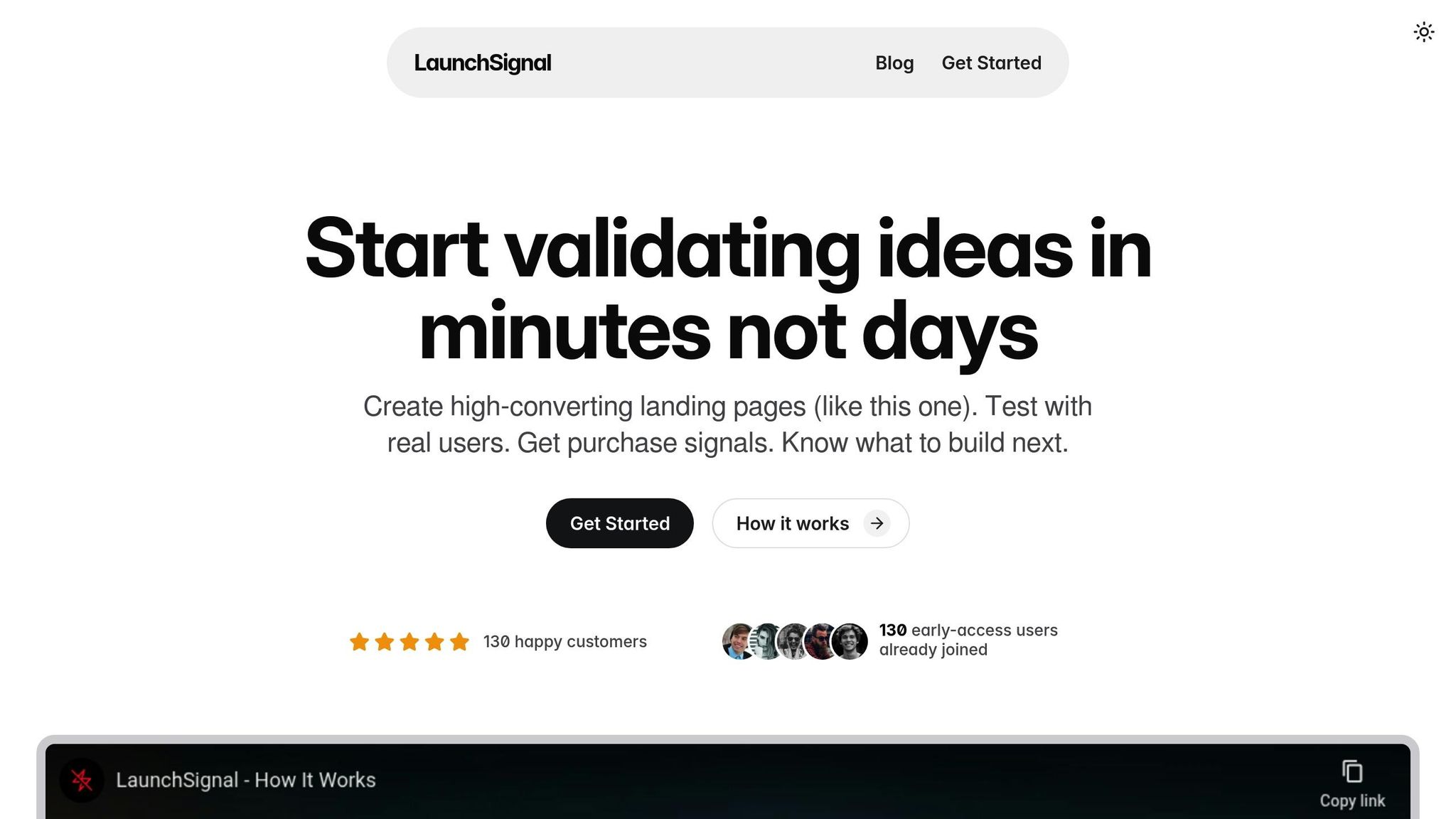
Start validating ideas in minutes not days
Create high-converting landing pages. Test with real users. Get purchase signals. Know what to build next.
Visit LaunchSignal